Trailer Planning: Narrative Theory, Storyboard & Shot List Plans
Production Logo
Production Logo
Panzoid clipmaker was used to create the introduction and production logo for our trailer.

The first thing that I did was set the time for the introduction. I think that 6 seconds is neither too long or too short.

 |
| Next I added the particles that will be moving throughout the introduction. The texture I chose for the particles was 'rings' and I decided to make them different shades of purple. |
 |
| I added a camera animation. By changing the position of the camera from 0.00 to 77.00 it created a zooming effect. |


 Chosen font and colour |
| The next object I added was text. After attempting multiple fonts I settled on World of Water. |
The colour I chose was a light shade of purple as I thought that it looked more aesthetically pleasing.
By Elizabeth Ogunsola
Meet the Cast
KMJE's Cast of The Vendetta:
Tia

Meet Tia played by Adetola Karunwi. She is the main protagonist of the film, a sixth former who has a group of four female friends. Her and her female friends are known as a "squad" aka a gang of friends, who are known to be quite deviant and troublesome. They get a lot of male attention and get into a lot of fights. However, they all have their own individual personalities that they bring to the gang.
Chance

Meet Chance played by Ladrie. He is the brother of the main protagonist, Tia. Ladrie is murdered by an off duty police officer when trying to defend his sister from a police officer. He is murdered by an unlawful stabbing that kills him almost instantly.
Shaniqua

Meet Shaniqua played by Peace. She is a part of Tia's gang of best friends, playing a part in coming up with a vengeance plan for the death of Chance, Tia's brother. Shaniqua is the loud, aggressive one of the group, always ready to fight and go against anyone who gets in her way.
Denise

Meet Denise played by Leila Ble. She is part of Tia's gang of best friends who all come up with a plan to get vengeance for the death of Chance, Tia's brother. Denise is the female known as the flirty, girly one who gets an awful, unwanted amount of male attention.
Michelle

Meet Michelle played by Isabella Trujillo-Cortez. She is also part of Tia's gang of best friends. She is known as the smart, hardworking one who is always focused on school work and getting good grades. But when it comes to fighting for her girls and protecting herself, she's always prepared and ready for action.
Thomas

Meet The Police Officer 'Thomas' played by Issac, the antagonist of the film, who murders Tia's brother, Chance. He is a married man with a ten month old baby boy. He has a drinking problem and tends to try to brush things under the rug in order to act like they're not there. When it comes to admitting if he killed Chance or not, he refuses to do so. He claims that it was self-defense and that Chance was about to attack him.
Lola

Meet Lola played by Princess. She is the wife of Thomas, the police officer that murders Chance and when finding out about her husband murdering an innocent boy, her anger takes control of her. This causes her to lash out towards her husband and resenting him.
Conjouring 2 Poster Analysis


There are features within the poster that conform and/or subvert away from from genre conventions.
Conventions
First feature of this poster that conforms to typical horror film posters is that it is set in a house, and house is usually dark and strange looking, all of this manipulation could show the audience that there is some sort of evil present.
This poster has the release date of the movie 'June 10th' present, this will help the audience know when the movie will be in the cinemas.
We are able to see the main character of the movie which is a little girl, so this gives the audience an insight on who the supernatural/demonic experience is occurring to.
Colour Scheme
The colours used in the two posters are black, grey and white and they've been used very similarly in both posters.
The majority of the two posters is black, the colour black is traditionally associated with evil, mystery and death and since majority of the poster is black, it gives off a feeling that an unknown presence is within them, almost like a black hole as the audience and the characters are unaware of how they/it will manifest within the characters.
As black is such a dark colour, the grey is used too show detail, for instance the torn off wall paper, the grey makes it more visable and this adds onto the mystery as we wonder what has caused all of the chaos.
In the first poster we see a grey figure emerging from the dark background, this makes that figure stand out especially since the character in the middle is dark, so it brings all of the attention to the figure in the corner.
There is a contrast between light and dark, the only light areas within the two posters are the light coming from the window and the rosey which is shown directly infront of the window, white of often linked with purity and safety, this may show that the rosey or through Christ it will lead the girl to safety, the fact that it is present twice shows how this icon is a significant object within the movie.
All of the important information are written in white so it stands out to the audience and also it makes it more easier to read since white and black contrast.
Models and Shots
Since this movie is part of franchise, we know that this movie is based on demons and exorcisms, the main character in both poster is made so seem vulnerable, firstly since it's a little girl and little children are shown to be innocent, so we feel more sorry that this is occurring to a young child, this is also shown by the mise-en-scene of the child as she is dressed in a robe which is red, red could show danger as it's the child being attacked by demons.
There is a close up shot of the hand, which helps make the icon of the rosary more visible which helps add onto the importance of the icon, and there is a long shot of the child, we are able to analyse the position she is in more clearly, in the first poster we see that she's standing in front of a window, which could possibly show that she might be attempting to jump out of it, and to the audience that could be seen as something is wrong with the child.
The child is on the floor and she looks frightened, however interestingly she isn't looking at the rosary, she is looking at something above it, which may be the demon.
Poster Analysis - Suicide Squad


These three posters from the movie Suicide Squad, there are
various features that these three posters have that conform to and subvert away
from genre conventions.
Colour Scheme
There is a repetitive use of bright colours in the posters,
I believe they’re used so that it can grab the attention of the audience. The
colour scheme of blue, purple and green subverts away from typical action and
thriller movies, they tend to use dark colours and this helps give the audience
the nature of the movie will mainly be filled with violence, suspense and
drama.
However, it can be understood why the colour scheme was
used, blue, purple and green can be seen as playful colours since they’re
bright, this nicely suits the genre of the movie as it contains comedic
elements and it can also reflect on certain areas of the movie, for instance
the colour green is associated with great healing powers, in the movie, the villains
were used by the U.S Embassy for a secret mission in order to help stop another
villain – this shows a link between the choice of colours.
The first poster on the other hand does conform to
thriller/action movies as it is quite dark, dark red is associated with rage,
leadership, and with that you can see that it was deliberate for the joker to
be placed as the main character on the poster as he attempts to launch his own
evil agenda.
Models and Shots
In the first poster it is obvious that the main attention
has been bought to the Joker, this may be due to the fact that out of all the
characters, the Joker more known by people, so therefore it’ll attract them
more to watch the movie.
The Joker has his typical pale skin and green hair, and this
time he is tatted-up, and with the mid shot, the mise-en-scene (including the
facial expression) of the Joker can be recognised even more making him appear evil,
as we usually picture him, his iconography of the guns shows that he a
murderous character, and the bullets shown on the background and on him (visible
around his chest area) shows how he’s invincible, and this is how we expect him
to behave.
The second and third poster shows the whole squad all in
costume (more visible in the second poster), they’re all dressed in weird
costumes and they’re all positioned standing together, however, notice how the
joker is standing on one of the X’s, this could help show that he has a
completely different motive compared to the others, even though the joker is
positioned by himself, we do see all the characters together, so this enables the
audience to see what type of characters are together which helps give them an insight
of what the movie should be based on.
Conventions
Focus Group Analysis
Year Eleven Focus Group:
Josephine and I conducted a focus group consisting of three year eleven students who were all female. We first showed them a trailer of the film 'SKET', a British Urban Gangster Film that consisted of an all-female gang instead of the typical male gang. Male gangs are predominately shown in Gangster Films but for our film we want to do something different and out of the norm. Then we showed them a second trailer of the film Lights Out, a Horror Film.
Firstly, we asked the girls what they did like about the trailer and one mentioned the fact that the Sket trailer was different and gangster, “street” films as she called it, usually have males featured in the film but this trailer featured girls. Another girl stated that she found it more interesting to see the girls’ perspective on how a life of crime is like. From this, I am fully aware of how our all-female gang will be perceived. Our target audience will like them, enjoy watching them and also be able to relate to them.
Secondly, we asked the three young females what they didn’t like about the trailer. One explained that she didn’t like the transitions in the trailer and felt that scenes were moving in and out too quickly. She felt confused sometimes and felt that there should have been a longer build up between scenes, to also create dramatic tension. They understood the plot of the film clearly from the trailer, something that needs to be the same for my own film trailer. However, what I don’t want to do is give away too much information within the trailer and bore my audience. I want to give away just enough information for the audience to want to watch the entire film.
Another key moment in the trailer that the girls said stood out to them was a bus scene between the female gang and a group of boys who were harassing them. A girl mentioned that she felt the tension increase in the bus scene and there was a lot of suspense as you wanted to know what happens next. In my own film trailer, I want to create a lot of suspense and tension, two key emotions that will be beneficial in making my target audience want to wait long enough for the release of my film. The scene between one of the female’s siblings and a dangerous drug lord was another key moment in the trailer that the girls found interesting. It was filled with a lot of tension and the heartbeat sounds in the background made everything seem even tenser and edgier.
Next we showed the girls the Lights Out trailer before moving on to asking them questions about it. From the Lights Out trailer, they liked that it was scarier than the first trailer we showed them. We weren’t surprised by this because Lights Out is a horror film, its main goal being to frighten the target audience. One of the girls mentioned that the trailer had a good build up from the beginning, something that I plan to create with my own trailer. I want there to be a good enough build up from the very start to capture the attention of my target audience from the very beginning. I don’t want them to lose interest and I want them to remain focused on the trailer until it finishes.
In addition to this, we questioned the girls about what they didn’t find interesting. One stated that she felt the trailer “revealed too many scenes” and could have worked on showing less in order to make it “more interesting.” I think from this I can connote that showing less is more and probably best. I want to shoot just enough scenes for my trailer but when placing all the shots together I need to try to avoid to reveal too much about the film plot. A goal of mine could be to create ambiguity within my trailer, so that the scenes are left open to interpretation by my target audience and they can determine what they think will happen in the film by themselves.
When asking the females which trailer they preferred they said, Lights Out, which was a surprise to us. We thought that they would choose Sket because of the all-female gang. But, they prefer the horror trailer because there was a lot of tension created between scenes and even though they felt that too much information was given out in Lights Out, they felt it helped moved the trailer along. Even though the girls said they preferred Lights Outs, when making a choice between trailers that give out too much information or just enough, they chose trailers that give out just enough information. The Sket trailer gave out just enough information but not in a smart, concise way. For my trailer, I want to give out just enough information but also create a lot of tension and stir enough emotion within my target audience in wanting to watch the entire film. Tension is definitely an important element of trailers because it keeps the audience interested and engaged with the trailer.
Year Twelve Focus Group:
The second focus group Martha & I conducted was a group of year twelve students with three boys and four girls. We showed them the Sket trailer first of all and asked them what they liked about it before showing the trailer of the horror film, The Conjuring.
One girl stated that she liked the juxtaposition of the girl gang and powerful male drug lord. She also liked how the girl gang began to take over the streets of London, leaving havoc wherever they went. In the beginning of the trailer, the drug lord was shown mostly and he was given more dominance on the screen. Showing the drug lord beating down on a woman showed the hierarchy and influence he had over her. Then mid climax of the trailer, the audience see less and less of the drug lord and more of the girl gang who are portrayed to be quite aggressive and violent. One boy stated that he liked the inter titles of the trailer, the words that came up as the trailer was playing. He liked phrases such as “in a man’s world” and “sisterhood,” as he found it to be quite good especially as the words were being brought to life with the actors and actresses being shown on the screen. It was intriguing to read the words while also seeing the actresses act out “sisterhood” and living “in a man’s world.” Intertitles are definitely something that I will be considering for my own trailer, as they add narration to the trailer especially if voiceovers aren’t used. This could be alternative to using voiceovers. One girl stated that she liked the mise-en-scene of the trailer, it not only represented the region of the girl gang but it represented their age range. The girls were living in an urban area of London, wearing tracksuits, with hoodies up, trainers. By the girls also dressing in tracksuits they were showing a masculine side of females, dressing how South or East London boys would dress. Even though the title of the film is “Sket” which is slang for a young girl who is promiscuous, without caring about who she’s sleeping with, the film doesn’t actually show young girls who are promiscuous. It shows girls who are labelled as being deviant and troublesome. So the word sket could actually have different connotations in the film, with the word Sket being used to describe deviant females of society instead of girls who are promiscuous. One boy mentioned that they liked how the females were fighting back because you don’t see that type of thing everyday, it’s not a norm. The norm is usually a patriarchal society where females are the weaker sex but they subverted from this conventions. One girl stated that the grime music in the background fit the purpose of the film and the beat dropped when someone got hit, creating tension.
In terms of what they didn’t like about the trailer, one girl stated that she felt like too much information was given away. She was able to tell the plot of the trailer from just watching it once. She got the idea of a girl’s sibling dying, she gets involved with a gang who plan to fight back. I have to disagree with her though because I felt that the trailer gave just enough information away so that the audience are aware of the plot. It’s important for the audience to know why the girl gang plan to get revenge on the drug lord so it’s mandatory for the audience to be aware of what he did wrong to the girl gang member. I do see where she’s coming from though and I will say that when creating the trailer, there shouldn’t be too many shots placed into the trailer. Things need to be concise, clear yet still understandable and intriguing.
The second trailer we showed the group was The Conjuring, a horror, thriller similar to Light Outs, the trailer we showed to the year eleven females. I first asked the focus group what they liked about the horror trailer. One girl said that there was a lot of dialogue between characters as things were happening. There was correlation with dialogue and scenes playing out the screen. One girl also stated that she liked the fact that the trailer followed the formalistic conventions of a trailer, it had the release date and at the end it had the social media information for the film. Social media is going to be a big influence on my trailer as I want my audience to be able to search for the film online and find out exclusive content that they wouldn’t find out from the trailer. I asked the group if the release date makes them want to wait for the film and some of them stated that it only depends on whether or not the film has sustained their attention enough. It would make it more exciting if the trailer was interesting and exciting enough.
One girl stated she didn’t like the trailer because it fit into the typical horror genre conventions, of someone of white ethnicity always being attacked by a deadly supernatural spirit and the cliché storyline of people coming together to try and fight against something evil. It follows the same theme as a horror story and same elements such as a haunted, horror house, possessed daughter and son. One boy stated that it wasn’t anything new, it basically followed the same storyline as many horror films out on the market today something many people have already seen before. One girl also mentioned that the film had the same general beginning, with the perfect family that has something evil come against them and destroy them. One boy mentioned he found the trailer quite long and that it should have been slightly shorter.
I also asked the group which trailer they prefer, they mostly stated that they prefer Sket. One girl said even though both trailers were quite lengthy, Sket told a story without giving too much information. It showed some of the important parts from each different scenes whereas The Conjuring followed a chronological structure, showing almost all parts from the film. They took up every scene and made it into the trailer, whereas Sket was more random, different parts of scenes. Sket also used music that correlated with the environment of the girl gang, which was grime. The Conjuring used a variety of sounds, mostly dialogue which created quite a plain tone at times. One boy also stated that Sket was more relatable in terms of some of the slang used by the girl gang and people from urban areas of London.
Key Learning:
From carrying out a focus group I have learned that people have different views on how trailers are presented to them. Both the year eleven students and year twelve students had different opinions about the gangster trailer and horror trailer. I’m glad to know that both groups preferred the subversion of a girl gang rather than a typical male gang that is predominately shown in gangster crime films. By carrying out a focus group I have drawn out the attitudes, feelings and reactions of students to two different trailers and hopefully able to get a similar understanding of how students will react to my own trailer. I will take into account all of the points stated by my focus group students and compliment my own trailer with their input. I have also made a decision that an ideal target audience for my film trailer will be from ages 16 and over because they’ll be easy to entertain and get engaged with my film trailer.
Focus Groups
Target Audience Interviews:
Question 1
How do you find out about new films?
Most of the interviewees find out about new films through word of mouth. I found that people are more likely to watch a film if it has been approved by someone that they know. The interviews also reveal that a lot people find out about new films through adverts, the main type being on social media i.e. adverts on YouTube. Other forms of advertisements that the interviewees use to find out about new films include bus adverts, TV adverts.
Question 2
How do you feel about a trailer revolving around a girl gang?
A majority of the answers given agree with the idea that a girl gang would be empowering. The interviewees liked the idea of females being in control and showing a more aggressive side to them that usually connotes with males. An interviewee suggested that the female gangster members would differentiate from the typical male gangster member. Other interviewees would have enjoyed observing how different a female gangster is from a male gangster. Also the interviewees found that this idea would be quite interesting as it subverts from the stereotype that gangs are very male orientated. However, a few interviewees did not find this idea for a trailer interesting as it subverted too much from gangster film conventions.
The reason that a majority of the feedback were in preference of a female gangster film may be due to the fact that a majority of the interviewees were female. I can infer from the results that our main target audience should be females.
What stereotypes do you associate with gangster films?
I noticed that a few stereotypes that the interviewees associated with gangsters contradict with one another; Most of the interviewees expected for gangsters to be dressed in rough clothing (i.e. tracksuits) and to live in quite derived areas, however they also expected for gangsters to wear gold chains and to have a lot of money.
All of the interviewees gave answers that connote with modern day gangster films, such as Kidulthood, Brotherhood, etc. instead of the original mobster films from the 20th century, such as Scarface, The Godfather, etc. This may be due to the fact that all of the interviewees are of a young demographic and live in urban areas.
Other stereotypes include: involvement with drugs, most of the gangsters being black and male, and the use of weapons (i.e. guns, knives, etc.).
Question 4
Which idea do you prefer for the trailer: conflict within the gang or conflict between the gang and something else?
At the suggestion of a trailer containing both the interviewees agreed that that would be ‘too much’ for the plot and one of the two would be a lot better.
Most of the interviewees preferred the idea of conflict between a gang and perhaps a rival gang. This idea imitates several other gangster film plots and this is perhaps why the interviewees preferred it. The interviewees found the idea of conflict between the gang members as too distressing as gang members are supposed to remain loyal to one another. They stated that gangs are supposed to be a family and therefore a fight between members would be too much conflict.
Question 5
Should the audience feel any sympathy towards the gang members?
The interviewees answered yes, however the audience should only feel sympathy to the gangsters to a certain extent. The overall response was that the audience should not forget that the gangsters are criminals, but should also consider the gang members’ reasons for joining a gang.
Question 6
What is the first thing you notice on a film poster?
The first thing that the interviewees notice on a film poster is the image and the title of the film. They said that the film poster is more appealing if a famous actor is on the cover or if the colours used are vibrant. The interviewees also responded that a shorter film title is more appeasing to the eye in comparison to a long film title.
Question 7
What do you expect to see on a film poster?
From the response given I can conclude that the interviewees expect to see a lot of weapons on the poster, i.e. guns, knives, etc. This is due to the fact that violence is what most people link to gangs. They also expected to see drugs and for the gangsters to be in quite urban clothing, such as tracksuits, trainers, etc.
By Elizabeth
By Elizabeth
Audience Questionnaire
By Karolina

Film Genre Research
Mad Max Front Cover Analysis- Empire Mag

On the top of the front cover "The 21 films to see this yer" is written across the top, this helps indicate that this movie, Mad Max Fury Road is one of the 21 films.
The main character of Mad Max, Mel Gibson, is positioned in the center of the magazine with a mid-shot of him, this is Empire sticking to their convention as they usually do this with main characters, this makes them the main focus and also since Mel Gibson is a very popular actor, it will make the reader more willing to watch the movie and to also read the article based on Mad Max.
Interestingly, the face of Mel Gibson is placed on top of the 'P' in Empire, this could be purposely done so that when its placed on display, the face of Mel Gibson is visable, and this will attract the reader to pick up the magazine and read it.
 |
| When its placed on display, the face of Mel Gibson is visable, and this will attract the reader to pick up the magazine and read it. |
For instance the colour white is usually associated with light, goodness and innocence, black is associated with power, death, mystery and formality and lastly red is associated with rage, anger, danger and courage - all of these colours represent key themes to expect within the movie for instance there is a lot of anger and death associated within this movie, so these all link very well with one another.
Most text in this front cover are 'colour coded' for instance the important information is in white whereas the others are black, since white is a colour that stands out for instance, even though Mad Max is not positioned in a place where it would appear to be recognisable and dominant, it is in white, so it shows some sort of importance, also below 'Mad Max' it says 'Tom Hardy reboots the carmagedoon!' this will show to the readers that this movie is part of a franchise.
There is a use of iconography which all links to the movie, for instance the use of guns and cars, this all gives the audience an insight or what the genre could possibly be.
The background of this picture is set in a relatively dark dessert, and notice how there is a small section of light, this can be seen as dualism, the contrast between dark an light, and we can see there is more darkness than light, the connection between this duality and the movie link very well, so it could show how someone/people are coming to over shine the darkness.

On the total film front cover a two shot image is used with the two main characters from the'Mad Max:Fury Road' film. The way Max is positioned portrays to the audience that he is the dominant character as he is standing in front of the female main character conveying patriarchy.Max is also looking directly into the camera for a direct mode of address to the audience. However the male main characters body language and facial expression is conforming to the stereotype that men are aways dominant. hence why the female main character is standing behind the male main character, implying he is in front to protect her.The woman is looking away from the camera - looking at her surroundings this could imply to the audience that she is unsure of where she is and is looking around for anything suspicious however the man is confident and is looking straight into the camera.The use of a mid-shot on this front cover is to make it able for the audience to see the characters facial expression but also to see the background and the setting they are in to help reveal the theme of the movie as well as the costumes and iconography.
The mise-en-scene of this front cover insinuates to the audience that the genre of this movie is a dystopian genre. the setting of the image gives this away as there is smoke in the air and trucks and cranes that can destroy things indicating to the audience that here is a theme of destruction. There is a gun in the male main character , which also relates to the theme of destruction as guns kill and damage. The female main character also has a mechanical arm which relates to the theme of destruction and the dystopian genre. the characters are wearing protective clothing
The placement of the masthead behind the male main character 'Tom Hardy' is a good selling point for the magazine. When magazines are placed on the shelves in stores , the masthead is one of the first things you see. Because Tom's head is over the masthead, that means that it will be spotted when stacked on the shelves and due to his very good career and popularity, people will pick up the magazine because they recognise him and his work, they then would be interested in watching this movie because he is starring in it.The placement of the title of the movie (in the middle) is also a god choice of placement. Once someone from the targeted audience picks up the magazine with Tom's head , they will instantly know the name of the movie as it is the first thing you notice, due to its big, red font. The language used on this front cover is very persuasive for example, "epic", "exclusive", "ultimate", these verbs are all superlatives which makes the audience feel like it is a must to purchase this magazine as it has these "epic"contents inside. The title of the magazine "Total Film" is in a white font with brown dirt like effect seeping in. This can insinuate to the audience that these two main characters are going to influence the majority which is the "MAD" people - and take over the majority.
Mad Max Film Market Campaign Analysis
Film Posters:


Comparisons Between Both Posters:
Conventions: Both Mad Max film posters conform to the typical conventions of posters having the main film title, credits, image of models, a slogan, release date, production company logo and movie rating. The first film poster is portrait whereas the second film poster is landscape. Despite the film posters being different sizes, widths and at different directions, this doesn’t affect the conventions that a typical film poster has. The first film poster does however subvert away from the usual mid-shot positioning of the models. Instead of placing the models at the centre of the film poster in a mid-shot or long shot, the models are placed in the top left hand corner. In addition to this, the film poster has a Dutch tilt, which is an unconventional rule for a film poster as models tend to be positioned in mid shots or long shots. However the models on the poster subvert away from this rule by being crammed into the corner. The second film poster conforms to text being placed on the film poster, however it subverts away from the convention of text being a not fairly largely size (titles are usually of a decent, medium size placed anywhere on the film poster) as the film title takes up the entire length of the billboard poster. This isn’t a typical convention you see on film posters today.
Shots & Models: Both film posters feature the same models. These are the main characters of the film and they are given the most attention by not being alongside any other cast members, only each other. In the first film poster the main male character is driving some kind of vehicle so he is placed below the main female. ON the other hand, in the second film poster, the male is standing above the females as she kneels down on one knees but both of them are pointing weapons in the opposite direction and defending each other from incoming enemies. The man being in front and the woman behind him in the first film poster could portray him as the protector, fighting off enemies for her. It could also illustrate the theory of patriarchy and how males dominate modern society. However, this could also be seen in a different way – the woman is the one overlooking observing and directing the man on who to fight off and how to save people. She might actually be the leader of the team. Whereas in the second film poster, the man standing above the woman could suggest the higher status that he has and his higher role in the film. She is more of a sidekick/assistant, someone who can help him during the battle fighting, however he is still the one in charge. In the first film poster, we are aware of the main characters being placed into a corner in a Dutch tilt. Whereas on the second film poster, we see the conformity of models placed in a long shot, as the characters are placed in the centre of a longshot. It enables the audience to see their surrounding location alongside with them and almost make them feel part of the action.
Text & Logos: Both film posters feature text. They both include the name of the film, the slogan, the credits, the release date, a social media hashtag, production company logos and rating of the film. The posters including the slogan of the film shows the connection being spread across the two film posters. Both of the posters are from the same film, just designed and presented differently. The audience are able to recognise this, not just from the film title, but the film slogan also. The film title on both posters are in the same font and colour, the only difference on the second poster is the size. The second film poster has the film title as the largest element on the poster and it runs across the whole width. The credits on both film posters subvert away from the typical credits you usually see on posters. On posters, the credits are usually full with names of actors, actresses, writers, producers and writers. However on the two film posters, there’s only the two names of the characters placed on the poster. It shows how their faces are the ones that are selling the film and they are of more importance than anyone else involved or behind the film. We also see a release date on both covers, telling the audience of when the film is to be released, possibly sparking interest and excitement amongst those who wish to see it. The production company logos have been included at the bottom of the posters, the typical placement of production company logos. It lets the audience be aware of the production companies behind the film. Furthermore, the film posters include a social media hashtag of the film name Mad Max. This is something that frequent users of social media will be able to recognise and know that they can tweet or Instagram about the film using this hashtag.
Colours: The main colours on the film posters are yellow, orange, blue and green. The use of the yellow bold text for the film title and credits enables the target audience to have a main focal point as soon as they lay eyes on the poster. It intrigues them and grabs their attention, the main agenda of a film poster. In addition to this, the colours of the location background where both posters are set (in a desert) are a dark blue, light blue and greenish colour. These colours create a sense of mystery, confusion and chaos all mixed into one. The fact these colours have been combined together to create a background could represent the craziness that will take place in the film and how two different worlds will be forced to battle it out against one another until one prevails.
Mad Max Film Market Campaign Analysis By Josephine Abosede
Suicide Squad Trailer Analysis
Frequently Mentioned Characters
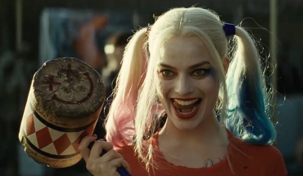

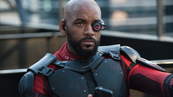
Harley Quinn Deadshot El Diablo
Sound
In the beginning of the trailer we are introduced with a section of the song Bohemian Rhapsody by Queen "Is this the real life? Is this just fantasy?" this could help give the audience small knowledge of the plot because it seems absurd for the government/police to ask villains for help.
We next hear diagetic sound coming from the prison door and non-diagetic sound from one of the villains who is shouting out of the window in a threatening tone "Let me outta here, Donald Please, LET ME OUT OF HERE!" this helps show the audience that they're obviously in prison and usually villains are in prison.
The muffled screaming once the officer shuts the window of the cell door suggests that the character has no escape from where he is, no matter how loud he screams, he was still locked in.
The Bohemia Rhapsody song links really well with scenes from the movie, for instance "No escape from reality" we see an scene where Will Smith who plays Deadshot in the movie is looking outside a small window with rain pouring outside.
The emphasis of Deadshot being hit by a police man is shown as non-diegetic sound, this is used to exaggerate the force used whilst hitting Deadshot and this therefore makes it sound more realistic and painful.
There are sections where the music stops, this is repetitively done in section that are funny for instance when Harley Quinn says "Hey boys" this adds comedic effects and this could help the audience distinguish the genre of the movie without being told it.
"I should kill everyone and escape?" the piano melody is played in allegro and the melody is high pitched, this I feel exaggerates the lunacy of the characters.
Editing
There are various cuts used throughout this trailer there are 11 cuts used in only 27 seconds, these jump cuts are used in only small sections of the movie, this helps not give up too much detail of what happens in the movie so it makes us want to watch more.
As well as showing different aspects of the movie these jump cuts at also help the audience see the different characters and what their powers are and how they're villains even if they have no dialogue.
Longer shots in this trailer are usually only used in comedic scenes and important scenes, this helps give the audience an idea of what to expect to come up during the movie.
Mise-en-scene
An establishing shot is used of the prison, this helps give the audience an understanding of what the movie is about which in this case a group of villains.
The costume of characters also contributes in giving the audience an insight on what to expect, for instance the prison warden is dressed in all black with a bullet proof vest and a helmet and he is holding a gun this helps show how dangerous the prisoners are.
The villians are dressed to look either crazy or dangerous for instance Harley Quinn has purple and blue hair clipped on and the character El Diablo has his whole face tattooed, this makes him appear psychotic and dangerous.
The Mise-en-scene in this trailer shows that audience what era it is set in, they are various modern props/areas for instance the shop in scene where Harley Quinn steals a handbag looks modern and the style of clothes put of display show that it was set during this era.
Subscribe to:
Comments (Atom)


0 comments: